Autonomous registration flow

Summary

Improvements to the onboarding and credentialing flow on a recurring payment management platform.
Team:
- Raphael Gonçalves (Product Designer)
- Manoel Eleutério (Product Manager)
- Thayna Santos (UX Researcher)
- Leandro Andrade (Head Design)

Responsibilities

- Data collection and analysis
- Generation of opportunities
- Prototyping
- Usability tests

Duration

Jan 2022 - Jun 2022

Identifying the problem

The current manual process for acquiring customers by the sales team is causing issues. To address this, we worked alongside the Product Manager to engage in an interactive session with key stakeholders of the project to pinpoint areas of concern and opportunities for enhancement in the customer acquisition process.
The main problems encountered were:
- High customer acquisition cost (CAC) because multiple credentialing personnel are needed to turn a lead into a customer;
- Lack of scalability, as more credentialing personnel would be required to increase the number of customers;
- Disqualification of customers due to the above issues.
"By not accepting small clients, we are giving up new monthly recurring revenue (MRR), the possibility of growing our base, and strengthening our competitors." (Acquisition Stakeholder)

Objective

To have a more efficient customer acquisition channel, reducing the CAC through frictionless customer acquisition and a satisfactory user experience.
Note: To achieve this goal, we carried out various projects.

Mapping processes

Commercial acquisition journey
To understand how we could act more effectively, I conducted an exploratory research study with the sales support team. The results of the study helped me better understand the company's acquisition model and the processes involved.
Self-service acquisition journey
Through the self-service flow, the lead can register on the platform at any time, try it for 30 days for free, and decide whether to sign up.
The self-service flow was initially developed by the Product Manager and my role was within the Registration, Onboarding, and Credentialing form steps.

Benchmarking

To have a baseline for improving the self-service experience, we conducted a benchmark research to understand the flow, visual identity, pricing, and product communication of companies that have been operating with PLG for longer.
With this analysis, we were also able to understand how other companies solve current problems with our product.

Registration flow

We decided to maintain an existing registration flow, however, the initial promotion of the feature yielded a poor 1% conversion rate. By utilizing the Hotjar tool, we were able to identify several issues that hindered the user experience, such as:

- The banner on the page, created by the marketing team, directed users to a sales team page instead of aligning with the self-service proposal;
- The feedback screen lacked necessary buttons, causing all flows to end there;
- The email confirmation and password creation process was disjointed, disrupting the overall user experience.

Registration screen V0

Feedback screen for registration V0

The sales team also helped by promoting the self-service link and we received feedback that there was a lack of information before the user registered. With this information, we were able to make small improvements with low effort and high conversion potential.

Sales team chat with customers who accessed the registration page

Registration Version 1.0

On the registration screen we removed the banner and added information about the service, added a login button and applied the design system components. On the feedback page we made the text more informative and added a button for the user to continue the flow.

Screen of V1 registration

Feedback screen of V1 registration

We had a satisfactory performance and proved that the registration flow was functional.

Table with information about registrations

Improvement points

The project execution took one 7-day sprint, aiming for impact with minimal time. The outcome was satisfactory, but important adjustments and improvements that required more time were left out. Future improvements identified include: no email confirmation required to access the platform, separating password creation from email confirmation, delaying CNPJ field completion, and adding the registration flow to the website to increase the base.

Guided Onboarding

The platform's onboarding serves all types of new clients, but clients who reached the platform using the self-service had less engagement than the commercial queue clients.

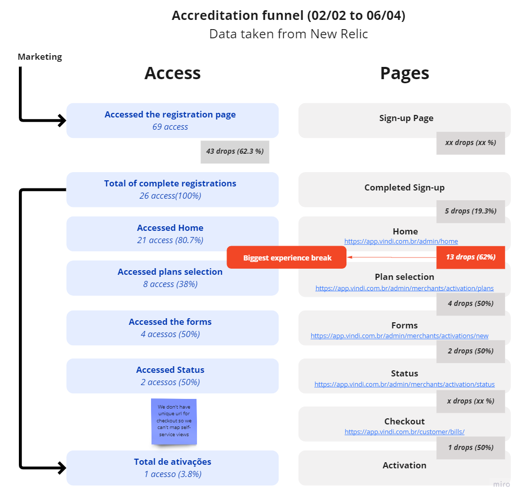
Funnel of clients who accessed the platform through self-service

By analyzing 11 recordings of these users through Hotjar, it was found that:
- 3 people entered the platform and left in a few seconds;
- 4 people started the guided onboarding and gave up on one of the steps;
- 3 people completed the onboarding but did not subscribe to the platform;
- 1 person completed the onboarding and subscribed to the platform.

Note: The Hotjar for this project was on the "basic" plan, so it couldn't record all platform accesses.

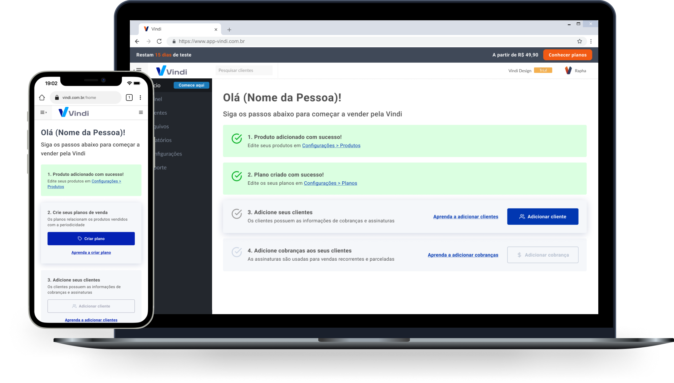
Building the interface

With an understanding of the problem, our goal was to create ways to guide users from their first contact with the platform to their first sale.

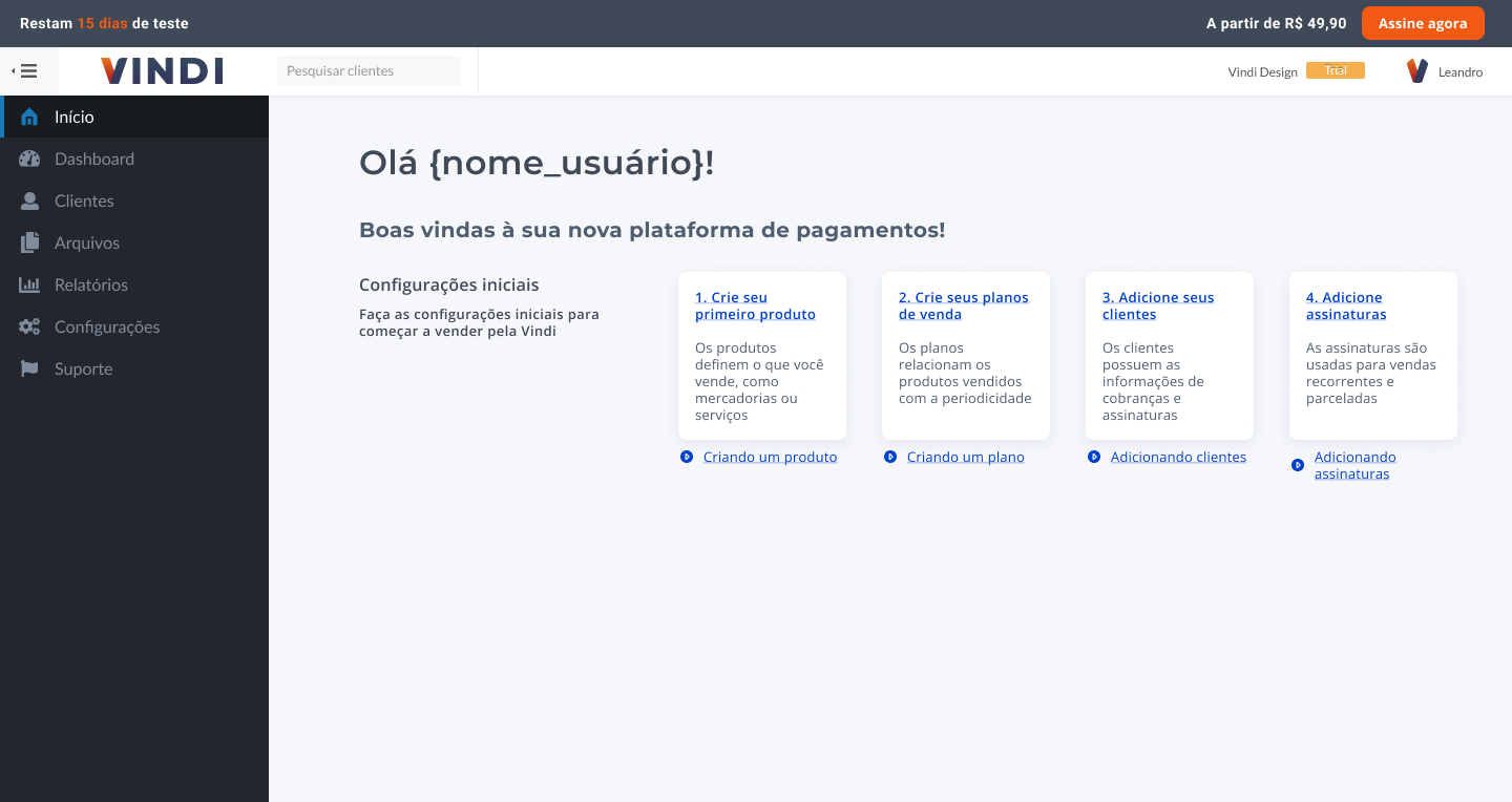
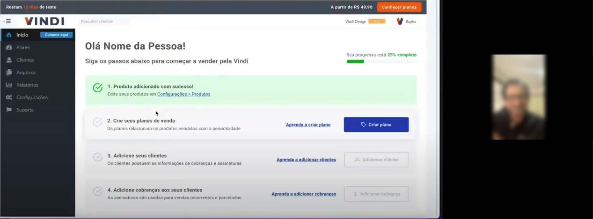
Current Onboarding interface of the platform (MVP)

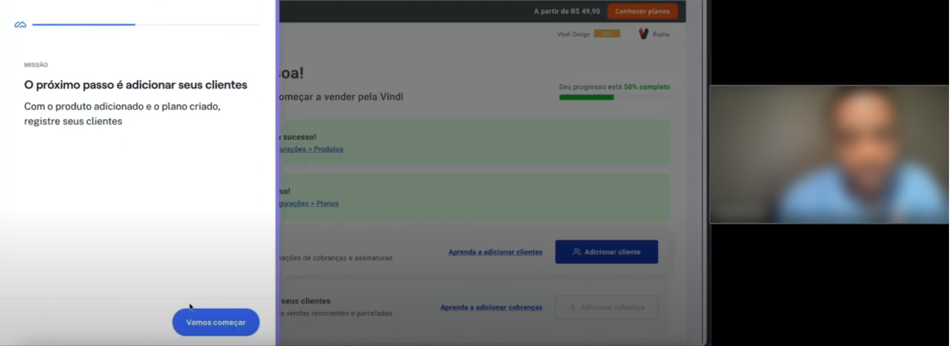
Version 1: We started by idealizing a "float" version that accompanies the user through each step of the onboarding. As the tasks are completed, the component presents the next task.
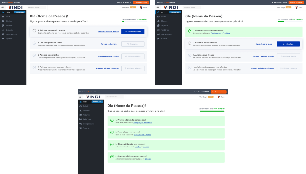
Version 2: We made improvements to the current active onboarding. We applied the design system and elements that make the steps more intuitive. We also took advantage of the use of the "Home" page dedicated to onboarding.

We decided to proceed with version 2 because the production effort is much lower than version 1.

Testing Usability

The overall objective of the test was to test whether users can perform the first steps of platform configuration through the new onboarding. The specific objectives were:

- Identify if the triggers for entity creation are correctly relevant;
- Evaluate if the success notification is functional;
- Verify users' understanding of the "Home" page;
- Identify if the links to tutorial videos are intuitive;
- Identify the effectiveness of shortcuts after entity creation.

The chosen metric was the SUM Rate of time (efficiency) / Success and error (effectiveness) / ASQ (satisfaction) and the platform chosen to conduct the tests was Maze.
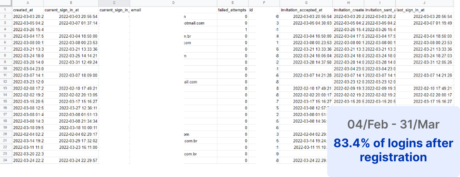
Recruitment was done through a hotjar survey, where we left it active for 24 hours on the homepage of a company partner platform. In the survey we left a link to the test schedule.

Results

In total, 3 moderated tests and 5 unmoderated tests were conducted. The most problematic point found was in the creation of entities, where even in the prototype we maintained the old interface to specifically identify these problems. The new Onboarding screen had good performance, it was the one with the shortest access time and 100% of people were able to identify the triggers without difficulty. Another point of attention is the text of entity creation, 37.5% of people had difficulty understanding terms such as "External code".

Moderated usability tests

Next steps

- Specify the new components for development and refine the story;
- Deliver to development;
- Work on the textual construction of the flow;
- Apply the Design System to entity creation pages;
- Create post-onboarding with tools to boost sales of clients.

Learnings

Insights from acquisition projects developed my more strategic side. Since the platform has many "legacy" components, every modification to the interface and code rules had to be well thought out as the complexity of development becomes high. I felt a positive boost in communication and documentation, as all decision-making was communicated both verbally and in writing to the company. I also learned how to create and specify components for maintaining the Design System.

If I could change something in this project, it would be the implementation of the Design System on the platform, as it would allow us more freedom in creation and the development would be less complex. I would also like more time to conduct moderated usability tests.